Foodica – Configure Mobile Menu
Starting with Foodica 2.0 you can control what menu is displayed on mobile devices. All you have to do is to head over to the Menus page, create a new menu or assign an existing one to the Mobile Menu location.
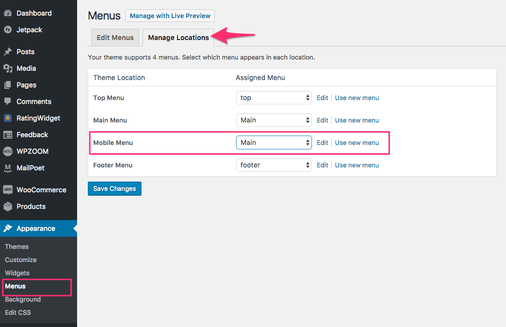
Usually, most of the people assign their Main menu as Mobile menu as well, but you can also create a separate menu in which you can include also links shown in the Top menu on Desktop computers.
In this way, your Mobile menu can be a menu with more links to combine both Top & Main menus, as on Mobile devices the theme displays just 1 menu location.
Related Articles
- Foodica – Overview, Demo Content Importer, Quick Specs
- Foodica – Changelog
- Foodica – Setup Video Tutorial
- Foodica – Free version vs. Premium version (PRO)
- Foodica – Upgrade from the Free version to Foodica Premium (PRO)
- Foodica – Recommended Plugins
- Foodica – How to add Recipe Cards
- Foodica – Recipe Schema Support & Recommendations for Non-Food Blogs
- Foodica – Customizations: Logo, Colors and Fonts
- Foodica – Social Icons in the Header
- Foodica – Configure Homepage Slider
- Foodica – Image Box widget (3 columns)
- Foodica – How to Make a Sticky/Featured Post
- Foodica – Recipe Index Page
- Foodica – How to Add Affiliate Disclosure
- Foodica – Infinite Scroll
- Foodica – Add Related Posts, Tiled Galleries and other Jetpack Features
- Foodica – Change Post Styles
- Foodica – Configure Mobile Menu
- Foodica – Configure Widgets
- Foodica – Tabs Section in Sidebar with Popular Posts
- Foodica – Instagram Bar in the Footer
- Foodica – How to add Advertising Banners
- Foodica – Recipe Index (using EasyIndex Plugin)
- Foodica – Known Issues & Fixes
- Foodica – FAQ