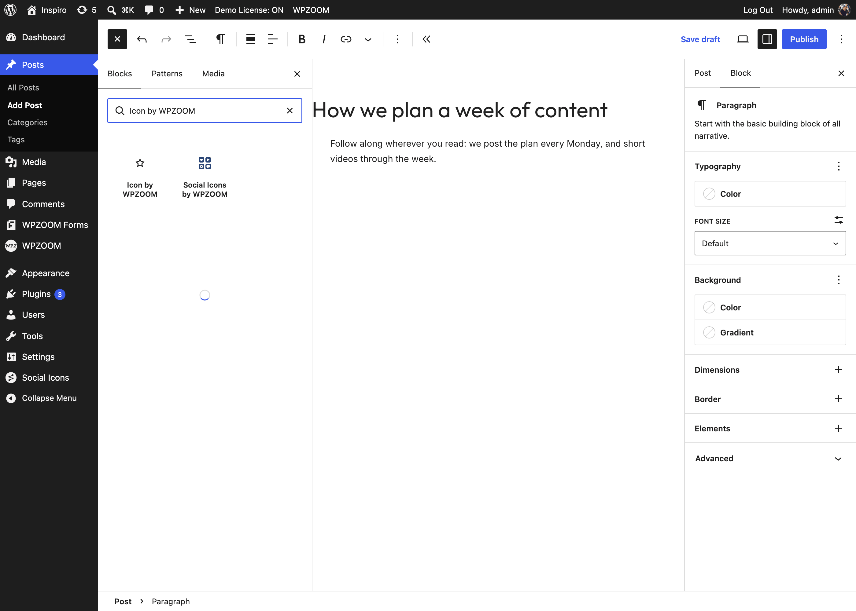
The Social Icons block puts a row of icons that link to your profiles anywhere the block editor works: posts, pages, templates and widget areas. Paste a profile link and the plugin picks the icon, its label and its brand color; then choose one of seven styles and adjust the size, colors and spacing for the whole row.
Table of Contents
The block starts with Facebook, X and Instagram icons and the block settings open in the right sidebar.
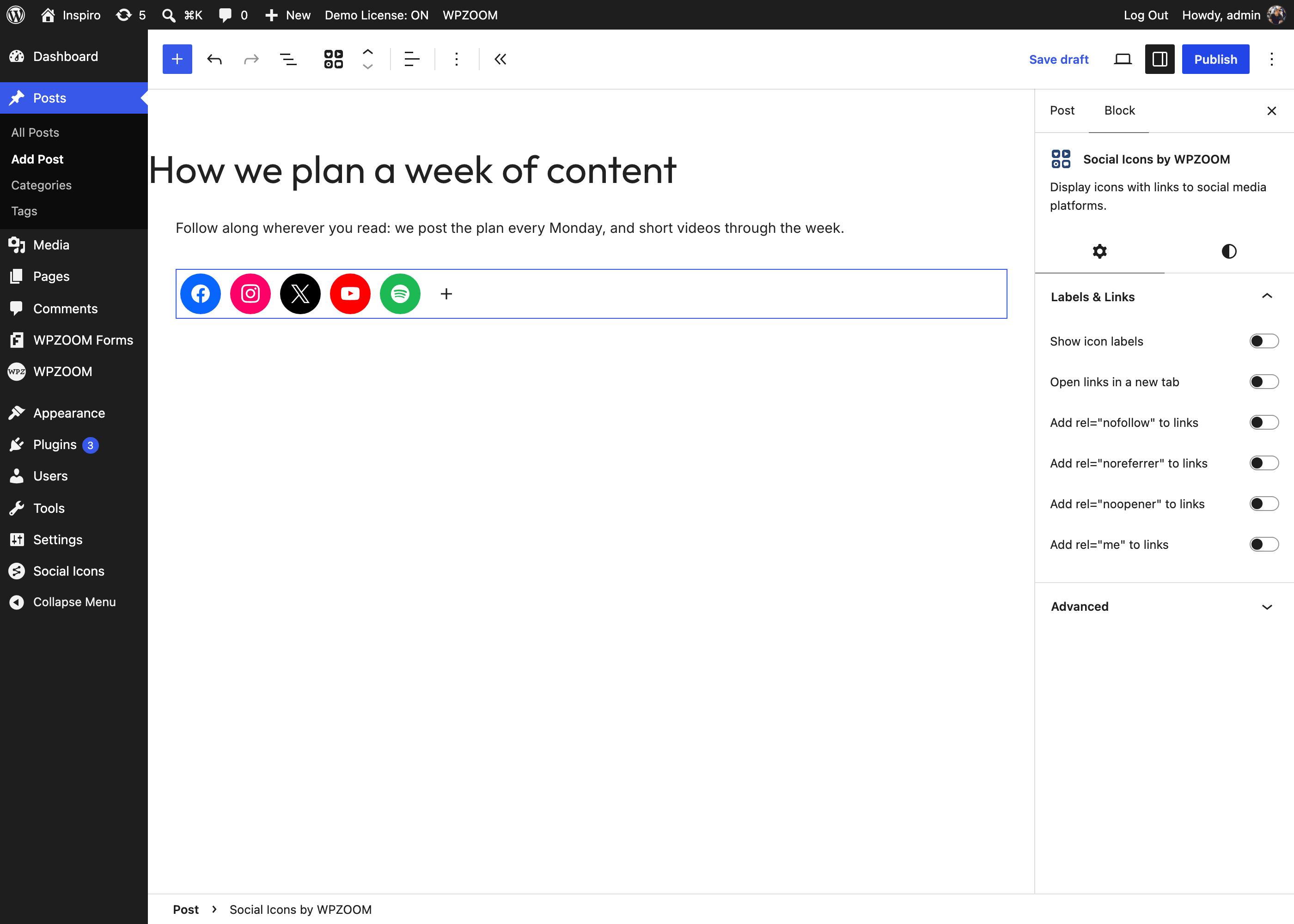
tiktok.com/@yourname, and press Enter or click Apply link and detect icon.The icon, its label and its brand color are filled in for you. The plugin recognizes more than 2,400 icons: social networks, apps and stores (TikTok, Threads, Bluesky, Substack, Linktree, Spotify, Apple Podcasts, GitHub…), plus mailto: and tel: links for an email or phone icon.
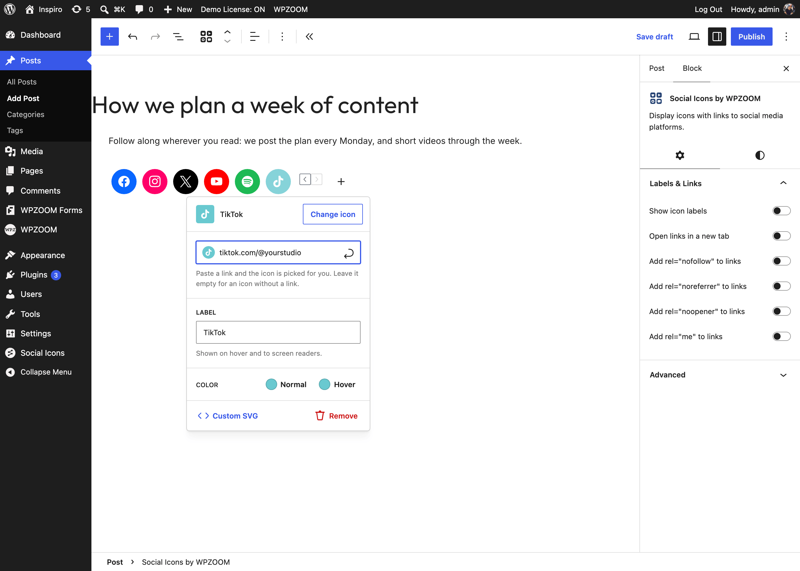
If no icon matches the link, the popover says so; click Change icon and pick one from the library.
An icon without a link. Leave the link field empty and the icon is shown but not clickable, which is handy for a phone or location icon next to a line of text.
Click any icon in the row to open its popover:
To reorder icons, drag them within the row, or use the arrows that appear on the selected icon.
Change icon opens the library with every icon set that is turned on in Settings. Pick a set on the left, or type in Search all icons to search every set at once; results are grouped by set.
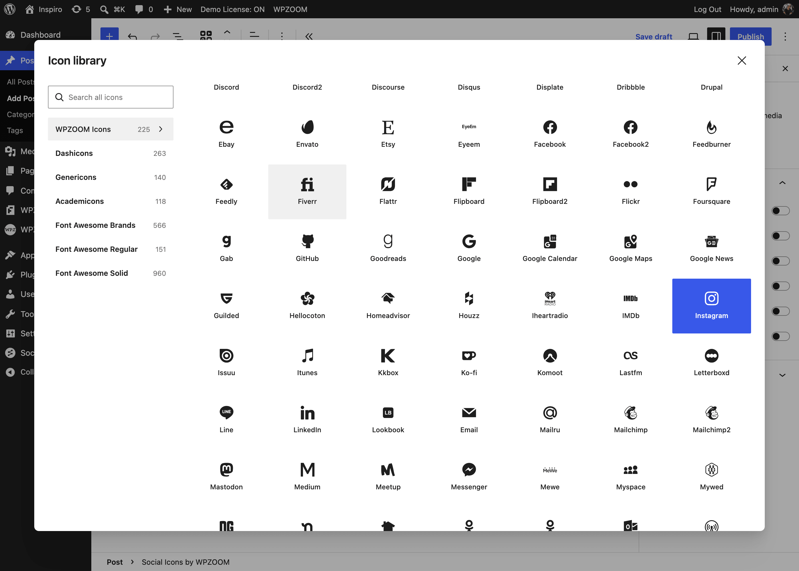
The sets are WPZOOM Icons (the main set: social networks and apps in their brand colors), Font Awesome (Brands, Regular and Solid), Academicons, Dashicons and Genericons. Which sets are offered is up to you: see Plugin Settings. Only WPZOOM Icons is on by default in the free plugin.
Open the Styles tab (the half-filled circle at the top of the block sidebar). The Style panel previews each style with your own icons, so you see the result before choosing:
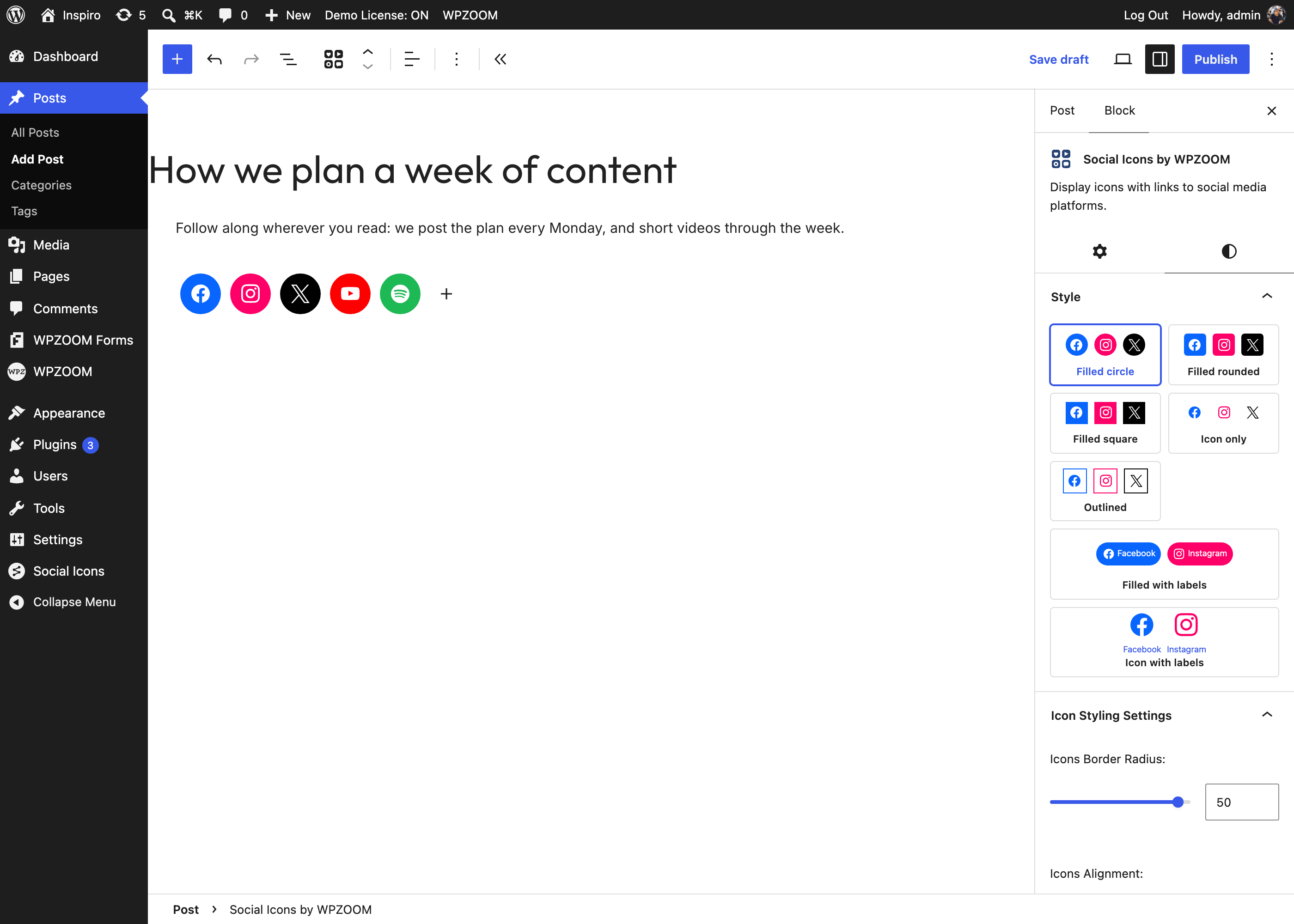
| Style | What it looks like |
|---|---|
| Filled circle (default) | White icon on a round brand-colored background. |
| Filled rounded | Same, with rounded corners. |
| Filled square | Same, square. |
| Icon only | The icon in its brand color, no background. |
| Outlined | The icon in its brand color inside a thin border. |
| Filled with labels | A rounded button with the icon and the network name. |
| Icon with labels | Icon and name, no background. |
In the Settings tab of the sidebar:
Per-icon colors from the icon popover take precedence over these.
The Labels & Links panel has:
rel="nofollow", rel="noreferrer", rel="noopener" and rel="me" for the links. rel="me" is what Mastodon and other services use to verify that a profile belongs to your site.To place one icon on its own, with or without a link, search the inserter for Icon by WPZOOM. It is the same block with a single icon and the “Icon only” style, so every option above applies.